Two similar but significant changes over the past week highlight the direction Facebook is moving when it comes to User Experience (how the user interacts with a web-based environment).
Picturfication?
Facebook rolled out two separate changes to the extremely important chat interface. While some users simply log on Facebook and examine or comment other's profiles, many people's primary use of Facebook is its chat feature. Facebook chat consists of 3 main sections:
- The sidebar friends list available on your "Home" page
- The friends list always available on the bottom right portion of your screen
- The chat box itself
Over the past week, Facebook has "Picturfied" the sidebar friends list and the chat box. Let's examine the changes in further detail.
The Chat Box
Last week, the chat box looked like so:

The components of the chat box included:
- The name and picture of the person you're chatting with on top of the chat box
- The name of the person who sent the last message in chat
- An option to clear the chat history
- Options to close or minimize the chat box on the top right
- Time stamps
- Option to close the chat box on the bottom right hand portion of the screen
- The ability to browse through chat boxes using the tab key
The chat box was sufficient and provided all the tools necessary to execute a plain-text conversation.
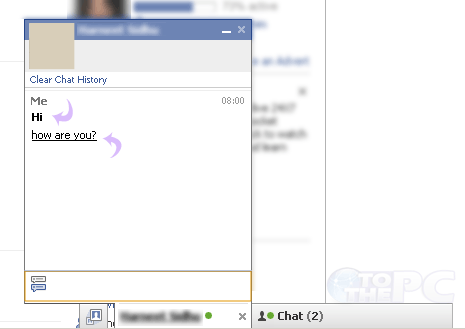
However, enter this week and the
new Facebook chat box.

The changes include:
- Removal of the minimize indicator (-) in the top right (The user is expected to know clicking on the blue bar's empty space minimizes the window)
- Removal of the close indicator (x) in the top right
- Replaced the name of the person in chat with their picture
- Removed ability to browse through chat what with tab key
Observations
The central dogma of User Experience design is removing the unnecessary. Notice in the list of changes how many times I used the word "remove". Generally speaking, removing bits of information from view declutters the interface. While in theory the new Facebook chat box is more minimalist due to its decreased functionality, it actually appears
less sophisticated and
more cluttered due to its new picture-chat style. Facebook believes the average user needs a visual reminder of who they're talking to every time a message is exchanged. Seeing the profile picture along with the name once at the top of the chat box sufficed. Seeing profile pictures over and over again in chat is simply obnoxious (and mildly insulting to the average user's intelligence).
The Sidebar Friends List
The sidebar friends list was only just recently introduced, and had simple yet useful features including the profile pictures, names, and availability of online friends.

However, to keep consistent with the Picturfication theme, Facebook changed this interface as well.

Observations
Facebook has stripped everything away except a tiny thumbnail of the profile picture. Now the user can no longer see the names of their online friends without mousing over the thumbnails. Additionally, the green and gray availability icons are extremely hard to see since they reside within the thumbnails themselves. In the event a friend changes their profile picture or has a profile picture set to something other than their face, you may not realize they're online.
Conclusion
While I whole-heartedly agree that a user should not have to work hard at all to enjoy the use of an interface, I believe Facebook has pushed this ideology to the extreme, incidentally diminishing the User Experience they aimed to enhance.
How do you feel about the new Facebook Chat changes?
October 17, 2010
 The components of the chat box included:
 The changes include:
 However, to keep consistent with the Picturfication theme, Facebook changed this interface as well.


